When we work with data, one of the most useful tools to visualize information is a histogram. A histogram gives us a quick snapshot of how values are spread out across a dataset. Among the many types of histograms, the unimodal histogram holds a special place because of its simplicity and clarity. It helps analysts, students, and researchers understand patterns in data with just a glance.
This article explains what a unimodal histogram is, why it matters, how to identify it, and where it is commonly used. We will also compare it with other types of histograms and provide easy examples to make the idea clear.
What is a Histogram?
Before diving into the details of a unimodal histogram, it is important to understand what a histogram itself represents.
A histogram is a type of bar graph that shows how often values appear in a dataset. Data is grouped into intervals or “bins,” and each bin has a bar that shows the frequency of data falling within that range. Unlike a simple bar chart, the bars in a histogram represent continuous intervals, not separate categories.
For example, if we have the test scores of students in a class, a histogram can show us how many students scored between 50–60, 60–70, 70–80, and so on.
What Does Unimodal Mean?
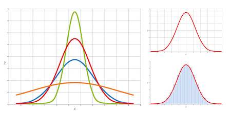
The word “unimodal” comes from two parts: “uni” meaning one, and “modal” meaning mode or peak. So, a unimodal histogram is simply a histogram with one main peak.
The peak of a histogram represents the interval where most of the data points are concentrated. In other words, it shows the value range that occurs most frequently.
For instance, if you plot the daily temperatures of a city for a month and most days fall between 25–30 degrees, the histogram will have a single tall bar in that range, making it a unimodal histogram.
Features of a Unimodal Histogram
A unimodal histogram has some distinct features that make it easy to recognize:
- Single Peak
The defining feature is one main peak in the graph. This peak may appear in the middle, to the left, or to the right depending on the distribution of data. - Clear Shape
A unimodal histogram can take on different shapes such as symmetric, left-skewed, or right-skewed, but it will always maintain one mode. - Most Data Around the Mode
Since there is only one mode, most of the data points cluster around that region. - Smooth Curve Representation
If you draw a smooth curve over the bars, it will resemble a single hump or bell shape.
Examples of a Unimodal Histogram
To make this concept practical, let us look at a few simple examples:
- Exam Scores: If most students in a class score around 70 marks out of 100, the histogram of scores will rise steeply near 70 and taper off on both sides, forming a unimodal histogram.
- Heights of People: Human heights in a population usually follow a normal distribution. This creates a single peak in the middle, showing that most people have average heights.
- Daily Commuting Time: Suppose most workers take around 30 minutes to reach work. The histogram of travel times will have a peak near 30 minutes, again showing a unimodal pattern.
Why is a Unimodal Histogram Important?
The unimodal histogram is not just a visual graph; it carries important meaning in statistics and decision-making:
- Simplicity in Understanding
With one peak, it is easier for anyone to interpret compared to more complex histograms with multiple peaks. - Helps Spot Trends
It quickly shows where most of the data is concentrated. - Foundation for Statistical Analysis
Many statistical techniques assume data is unimodal, especially when working with normal distribution. - Useful in Quality Control
In industries, unimodal histograms are used to check if a product’s measurements (like weight or size) are consistent.
Comparing Unimodal, Bimodal, and Multimodal Histograms
It is easier to understand the meaning of a unimodal histogram when we compare it to other types:
- Unimodal Histogram: One clear peak. Example: Human body temperature distribution.
- Bimodal Histogram: Two peaks. Example: Test scores when half the students study hard and half do not.
- Multimodal Histogram: More than two peaks. Example: Age distribution in a community with children, adults, and seniors.
From this comparison, we can see why the unimodal histogram is the simplest and most common type.
Shapes of a Unimodal Histogram
Even though all unimodal histograms have one peak, the shapes can vary:
- Symmetric Unimodal Histogram
The left and right sides look like mirror images. Example: Normal distribution. - Right-Skewed Unimodal Histogram
The peak is on the left, and the tail stretches toward the right. Example: Household income data. - Left-Skewed Unimodal Histogram
The peak is on the right, and the tail stretches toward the left. Example: Age at retirement.
These variations help researchers identify not just the mode but also the tendency of the data.
How to Identify a Unimodal Histogram
Recognizing a unimodal histogram is simple if you follow these steps:
- Plot the data into a histogram with equal bins.
- Observe the number of peaks or tall bars that stand out.
- If only one clear peak is present, the histogram is unimodal.
Be careful not to confuse small bumps with additional peaks. The true mode is usually much taller than other bars.
Real-Life Uses of a Unimodal Histogram
The unimodal histogram appears in many fields:
- Education: Teachers use it to analyze how most students perform in exams.
- Healthcare: Doctors and researchers use it to study body temperatures, blood pressure, or cholesterol levels.
- Business: Companies use it to check product quality and customer satisfaction.
- Economics: It helps in studying average salaries, prices, and spending patterns.
Advantages of a Unimodal Histogram
- Clarity – Easy to read and understand.
- Common in Nature – Many natural and social datasets form a unimodal pattern.
- Statistical Relevance – Works well with many statistical models.
- Quick Insights – Provides an instant picture of where data is concentrated.
Limitations of a Unimodal Histogram
While the unimodal histogram is highly useful, it also has some limitations:
- It cannot show complex patterns when data has multiple peaks.
- Small datasets may create misleading peaks.
- Choosing inappropriate bin sizes can distort the shape.
Therefore, it is important to plot the histogram carefully and use it alongside other statistical tools.
Conclusion
A unimodal histogram is one of the most straightforward yet powerful tools for data analysis. With its single peak, it highlights where most of the data lies and provides quick insights into patterns. Whether in education, business, healthcare, or daily life, unimodal histograms appear frequently and remain central to understanding information.
By recognizing and interpreting a unimodal histogram correctly, anyone can make better decisions based on data. Its simplicity, clarity, and wide applicability make it a foundation for learning more advanced statistical concepts.